English content Originally posted on ELLO
Building a new logo
It’s been a very very very … (let’s do it once again) very long time since I wanted to update my logo. I’ve made a few changes during the last 7 years, but I’ve always kept my kind of pinup figure. It was the first « symbol » I ever used and I kept it every time I tried to iterate my logo.

Consistency is an important matter, in particular when you deal with logos and types that are meant to represent yourself or your activity. Despite that, I have always been fascinated by the power of simple lines and this figure wasn’t suitable for that. I’ve been through thousand of iterations, from the geek to the hipser, from the bad to the worst, I never felt I had achieved something good enough to be even tested.

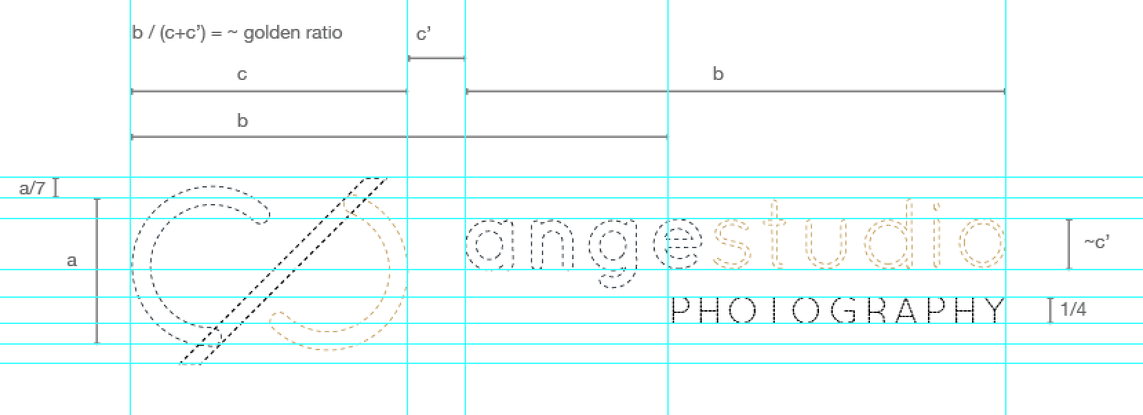
Last week I came up with the simple idea of joining in the lowercase version of ‘a’ and ’s’. Yea this is simple, even simplistic ; but sometimes the most simple ideas are the hardest to make come true. I also wanted to introduce this kind of strengh you have in very well known symbols, that’s why I added the infinity loop; which is basically a perfect definition of « work » :) Finally I was missing the notion of technical, scientific rigour … a kind of mathematic dimension, so I tried to add the golden ratio. I edited the symbol a few times and it didn’t work, at all. I finally figured out that I could introduce this notion while adding the text. And tadaa.
Last but not least, color. This is where I find my consistency. Black and greys have been updated with a little tint of blue, not 100% sure about that though. That might evolve again. Gold is still the same color, that I have found so many years ago, keeping this way my past in the symbol itself.

It is still a work in progress though: just because it took so long to achieve something I’m pretty happy with, that I definitely need to put it at rest. This post allow me to end the first stages of the process by publishing. Next, I have to step aside for a few weeks, see if I still like it with fresh eyes and then proceed.
Time is definitely an actor in the creation process, don’t you think?

No comments.